Thuin city
Devenez un Thuintraveleur!
case
04
Art direction - UI-UX design - Branding - Web
Challenge For each citizen
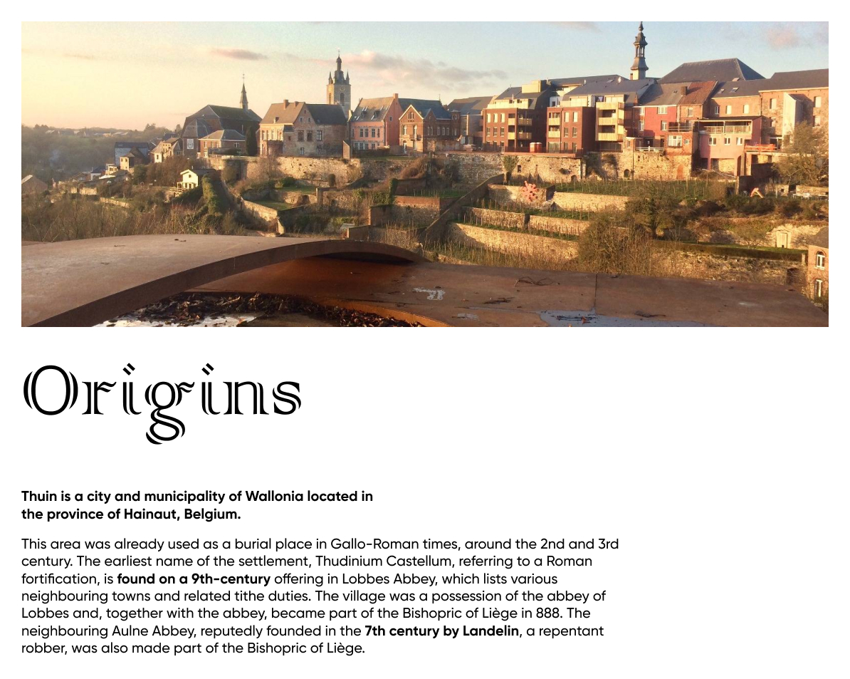
Thuin is a city is located in the province of
Hainaut, Belgium.
A city that needed to refresh and develop a new visual identity, to look more modern yet
reflect and preserve the old and antic side of the city.
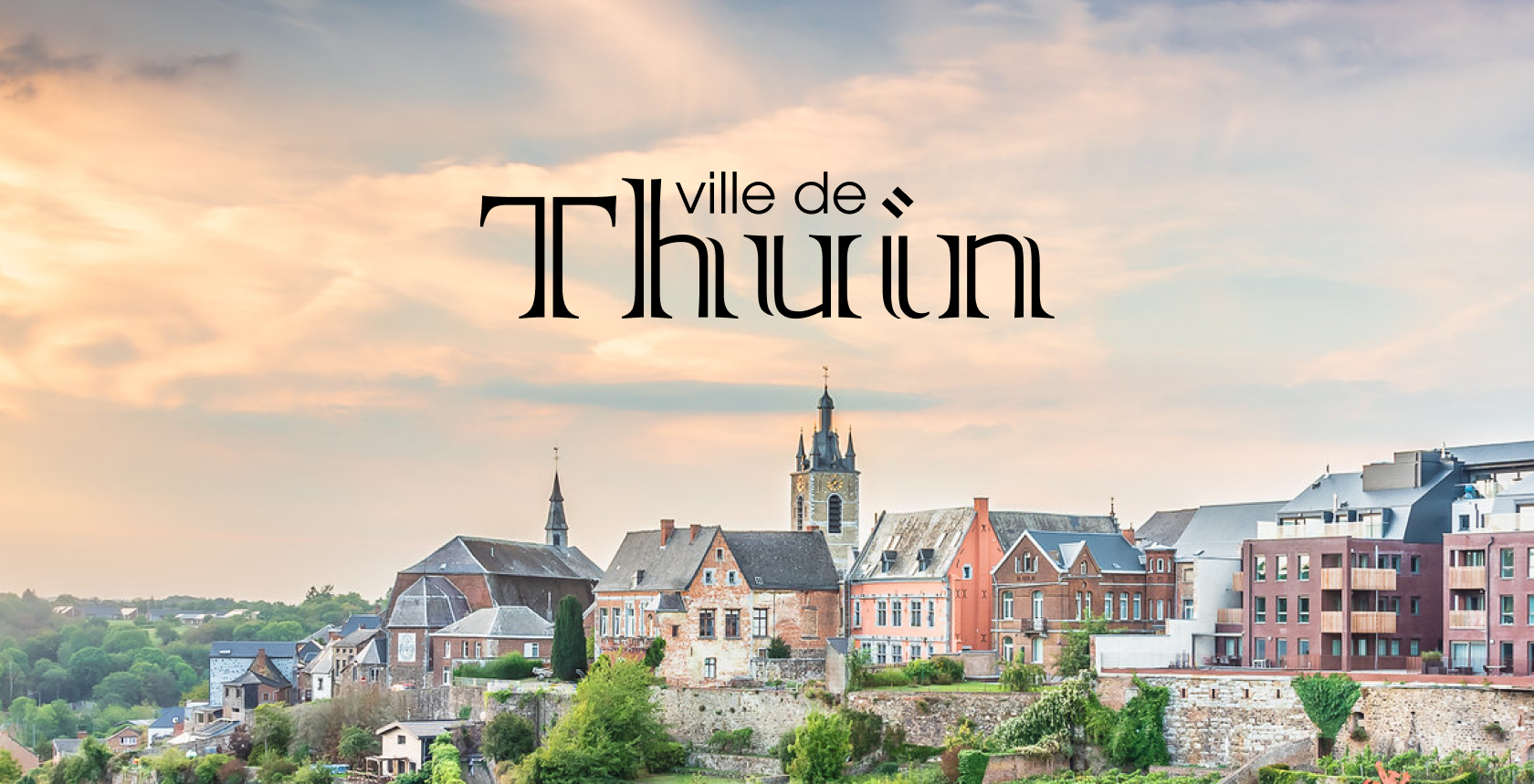
A new scalable design system that captures viewers eyes, unifying Thuin city’s brand language to match new digital world
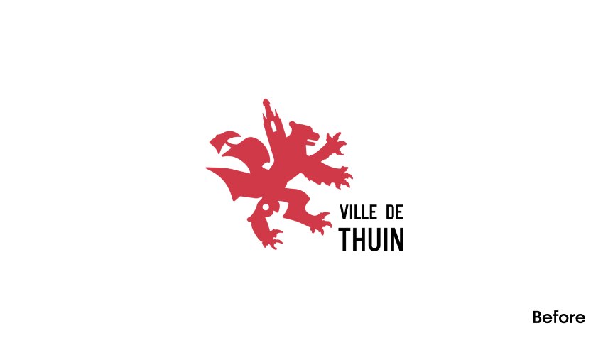
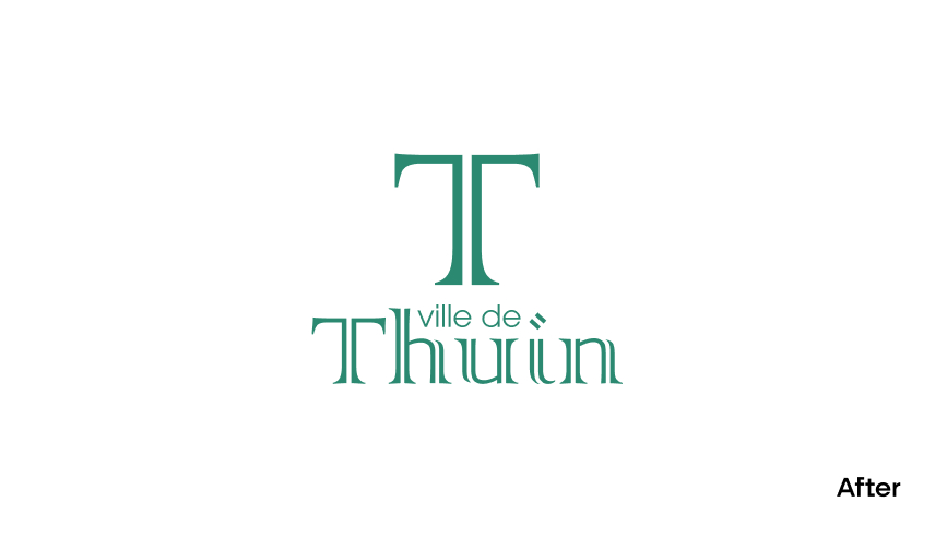
Solution
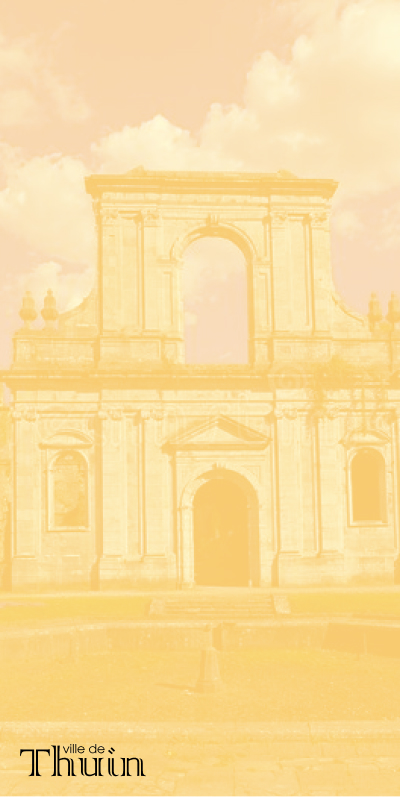
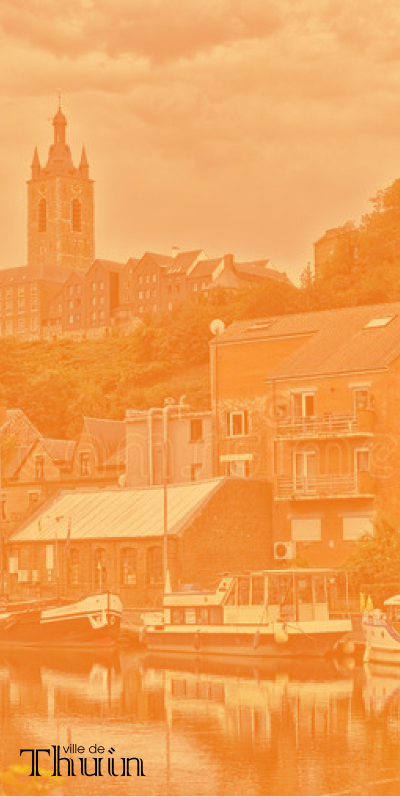
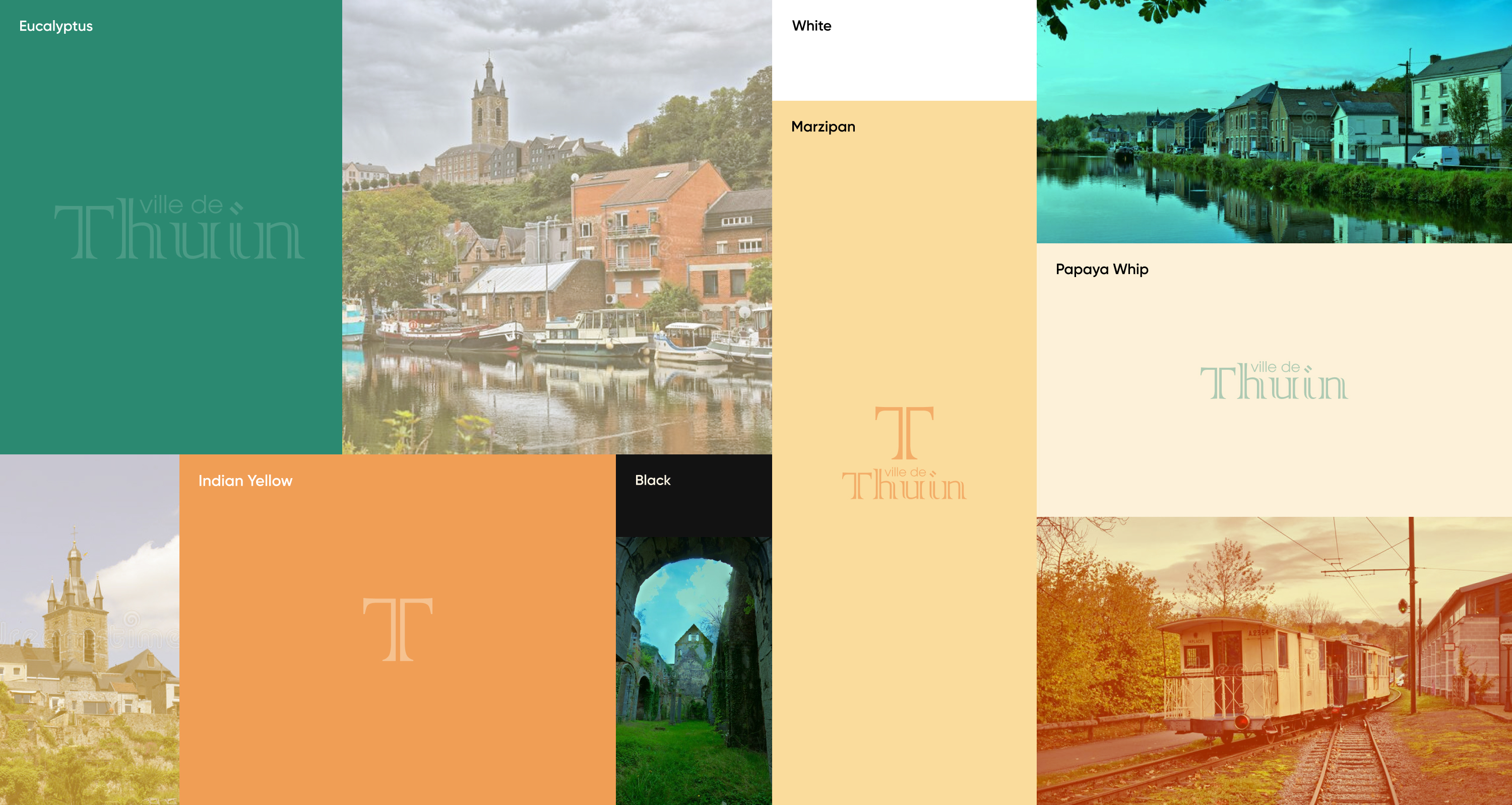
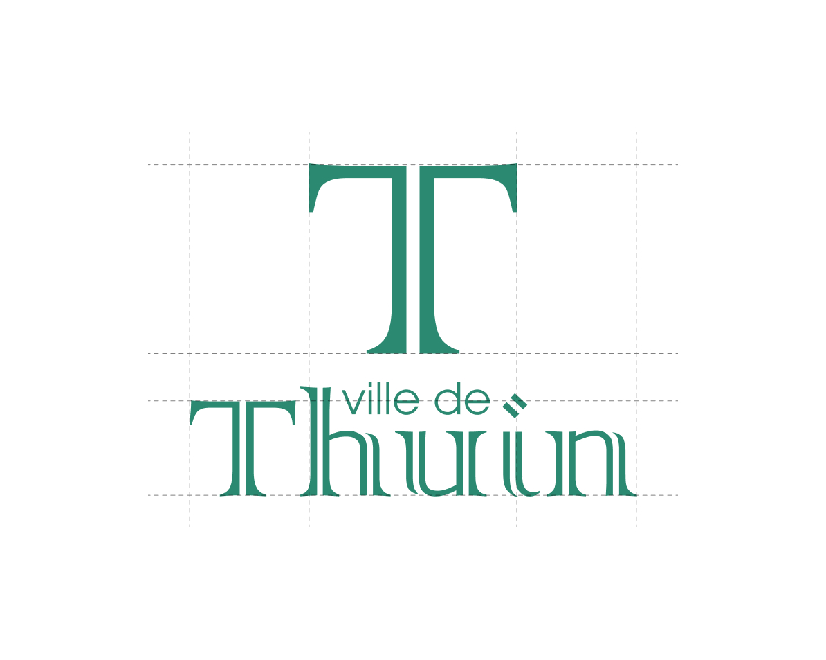
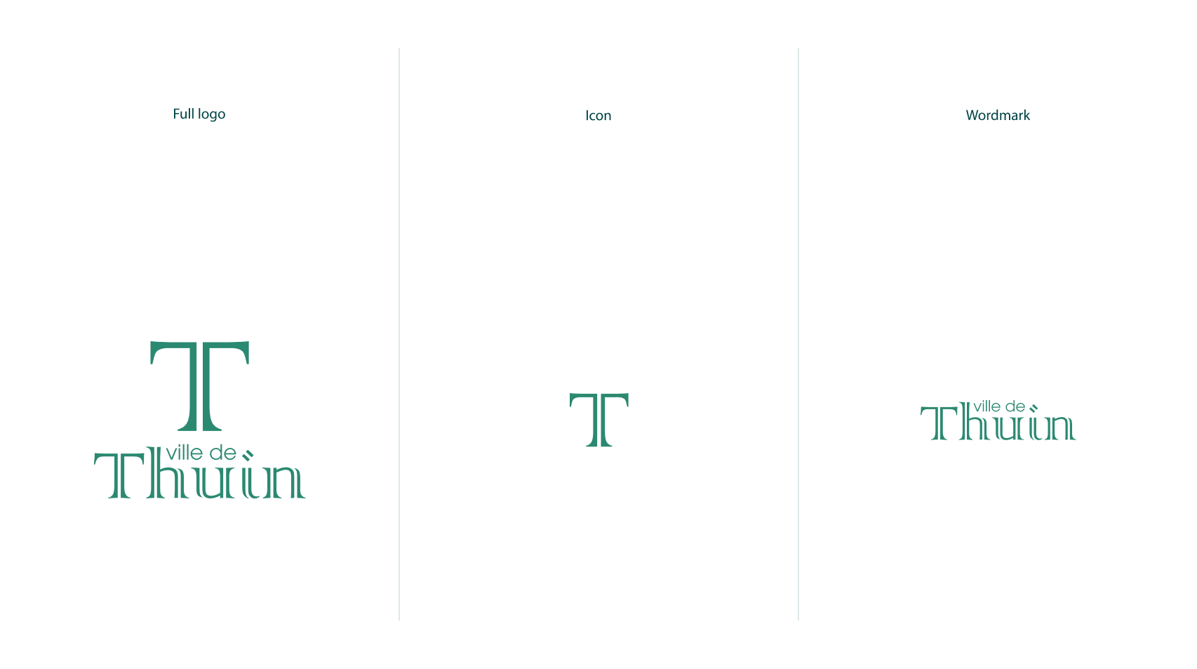
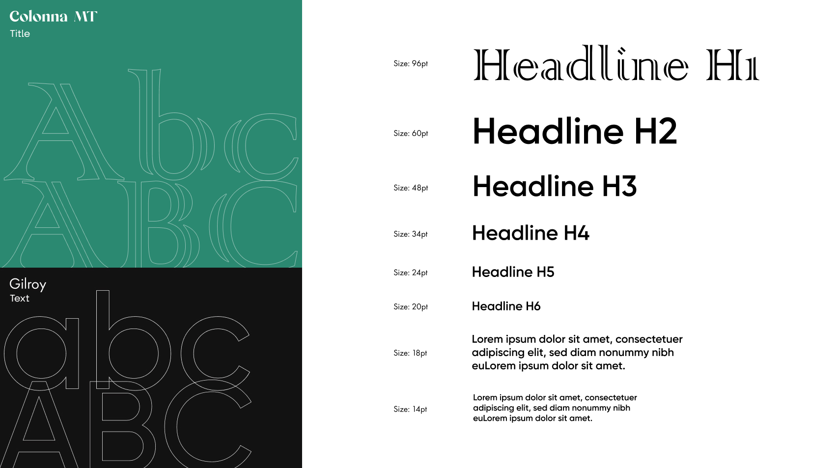
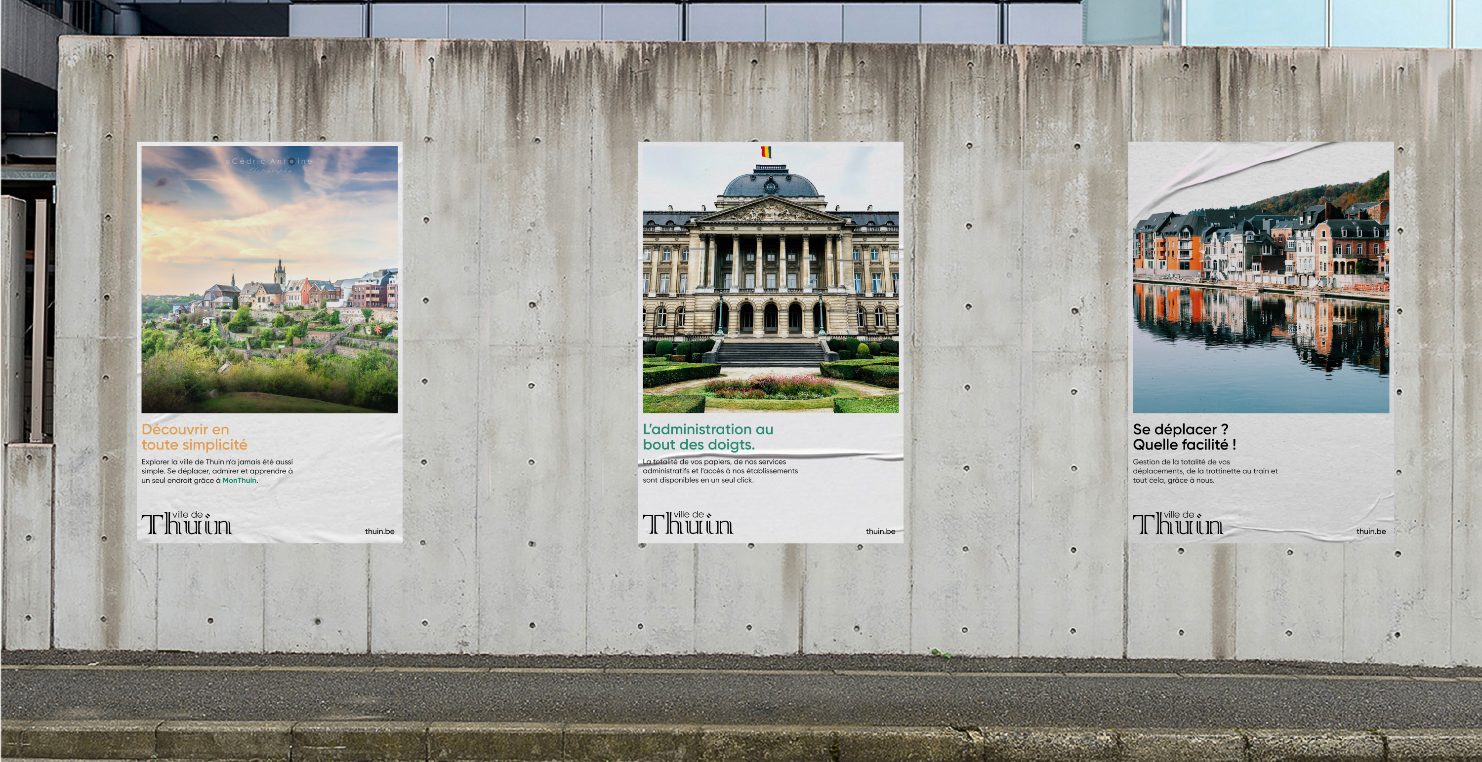
We created a logo, that looks modern but maintains the history of the city by using the "Colonna MT" font, which is based on one of many monuments in the city. for the colors, we have created a contemporary palette inspired by the different elements of the city.
Process
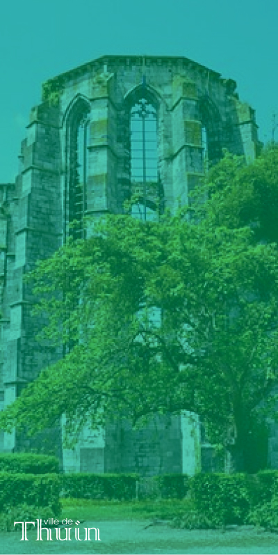
The new Thuin logo is based on and inspired by one of many
architectural monuments. Which is
a nice nod to the city’s past, while the new identity drives them into the future. The main
color is inspired by the green space of trees and grass, which covers so many spaces and
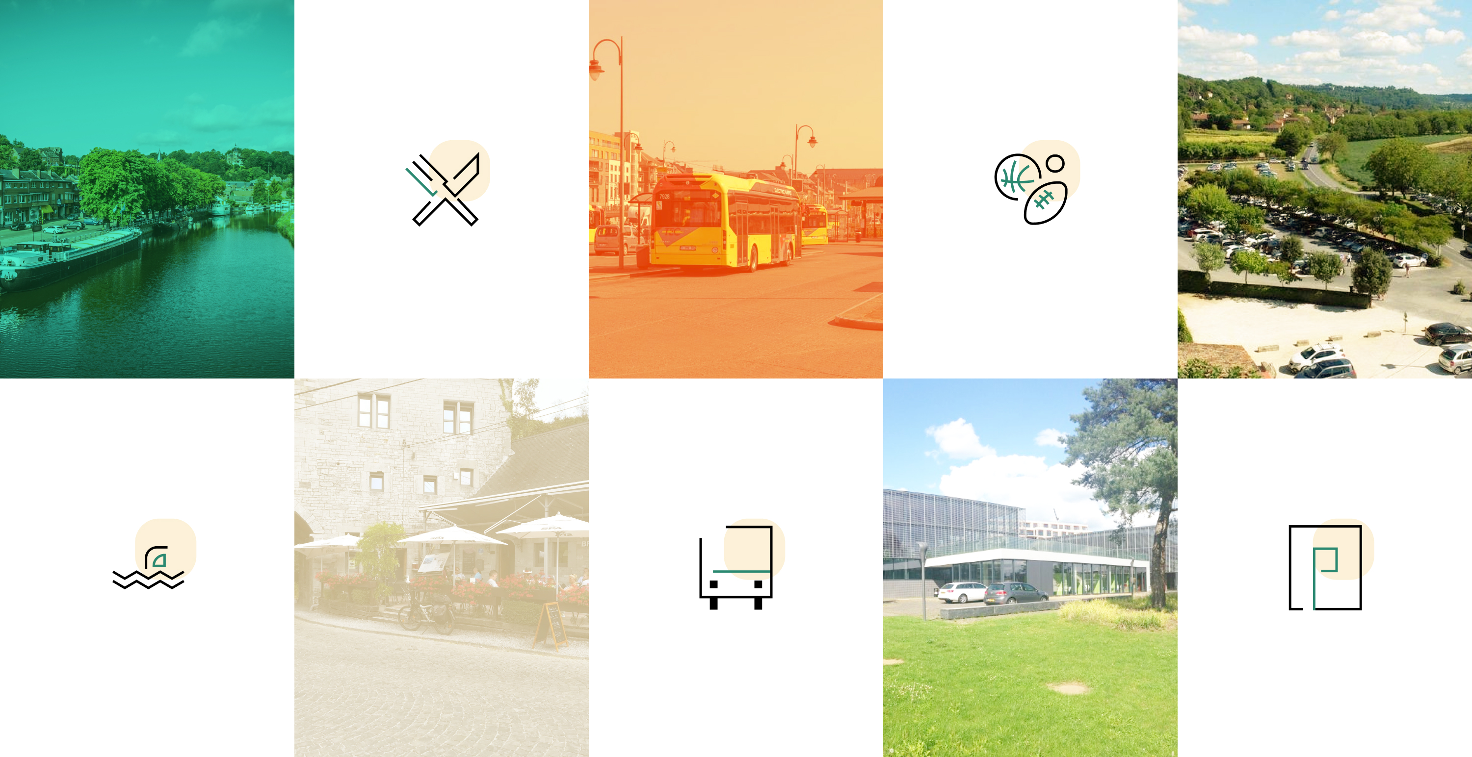
historical buildings in the City. We also created a whole suite of unique icons that
represent different activities that the city has, and every person living (in) Thuin could
be and feel related to.
Color
The new identity is modular and allows a cohabitation with the historical identity, by bringing a graphic system more adapted to the new uses accompanied by pastel and neutral color palette.
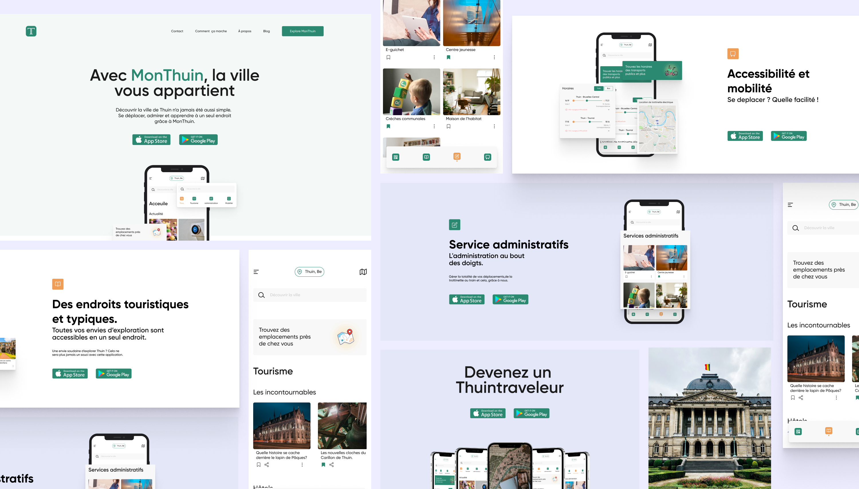
Thuin city went digital
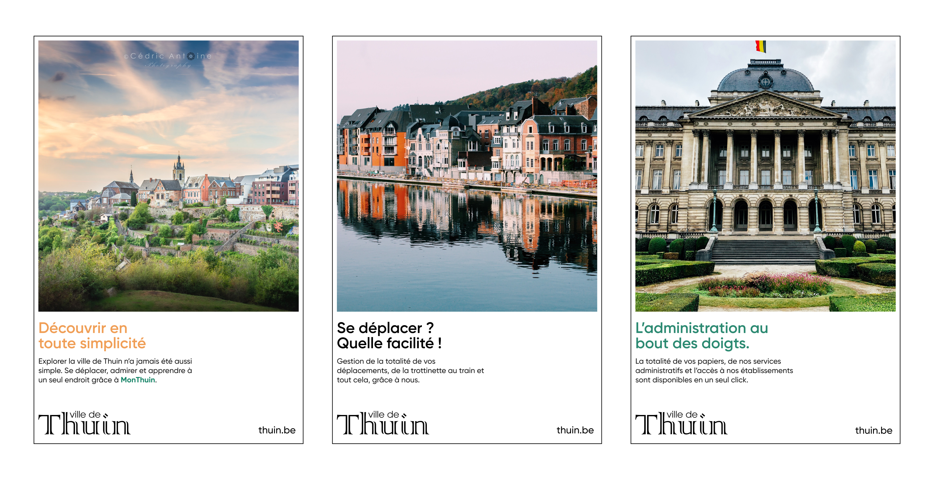
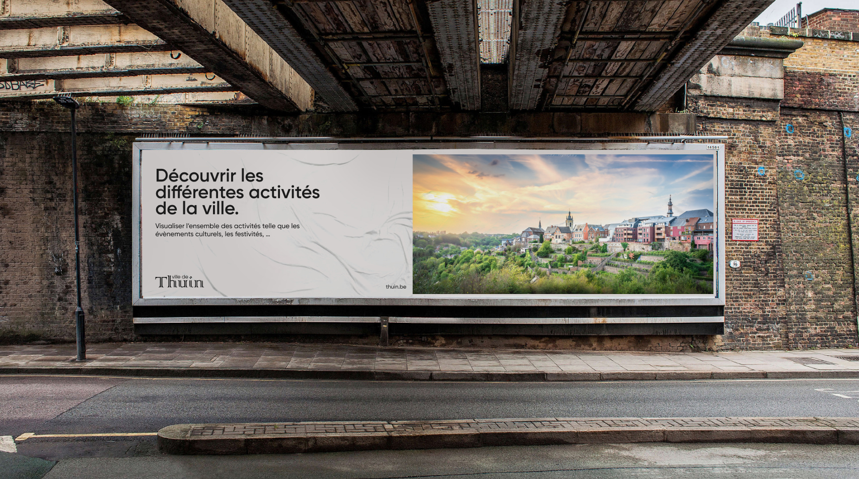
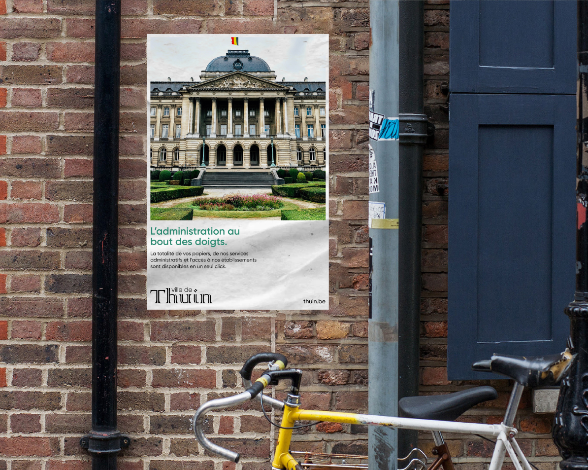
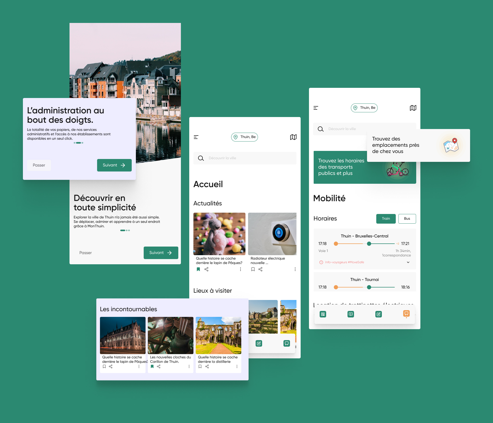
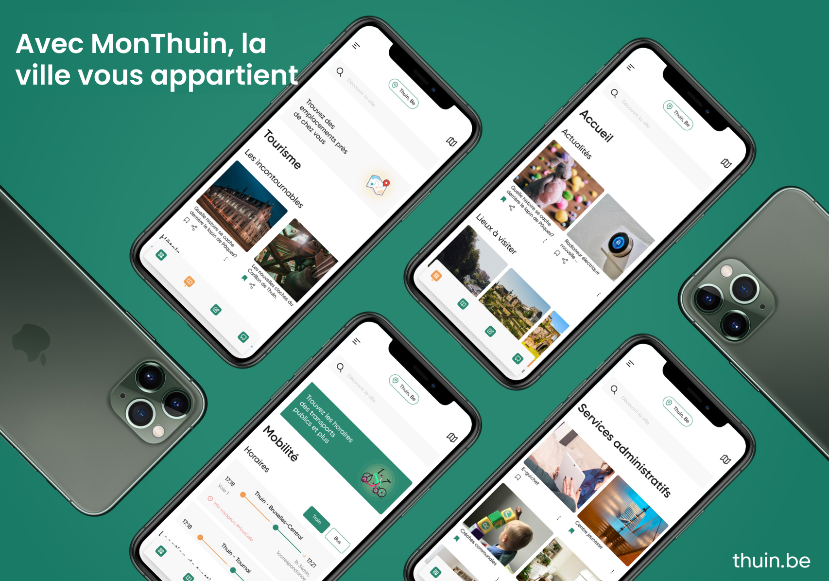
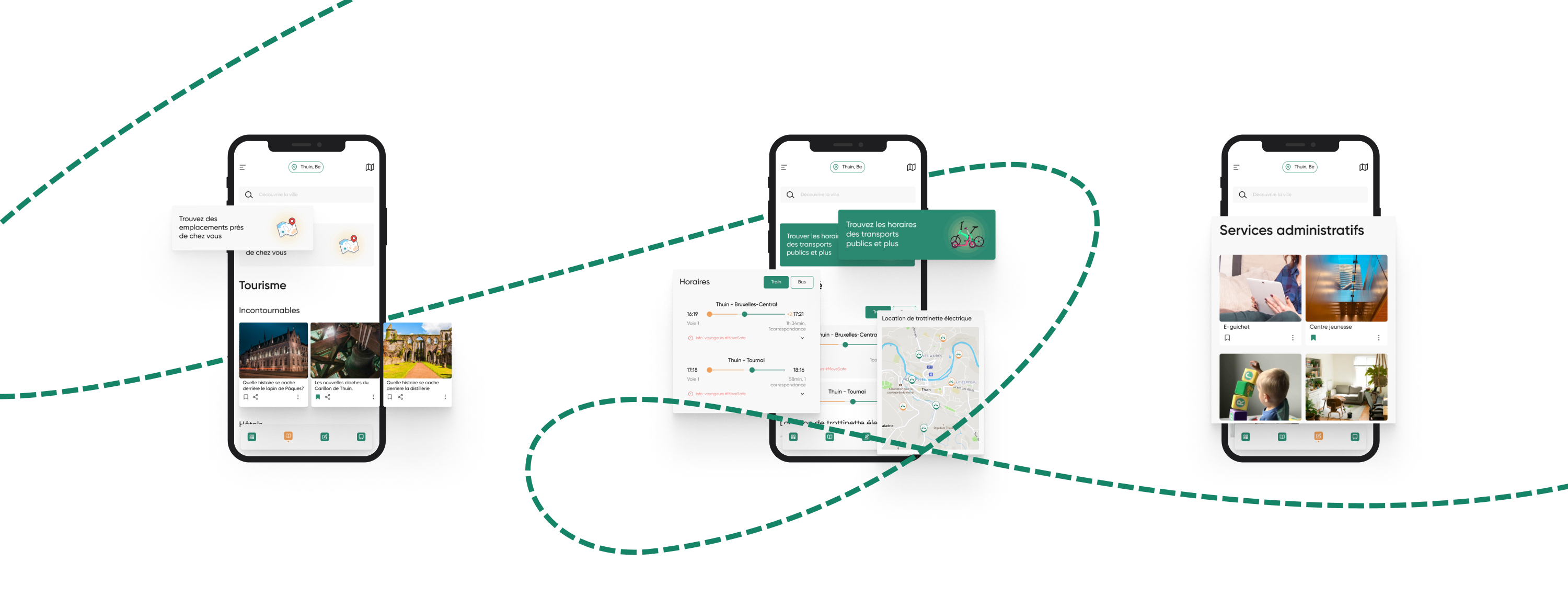
We’ve created a mobile application as a part of the rebranding, not just to facilitate the
life of the residents but to encourage tourism as well, and get to know the different
activities in the city.
View project.

Design system
The brand URL system is featured heavily throughout the site, working both as a page header and navigation breadcrumb.

Other case studies
Branding - UI design
Tondo - African music app.UX*UI - Digital - Micro-Motion
Dials Application - Your keypad is more than numbers.